Space – Depth of FieldValue – black and white finalTextureSpace – not a lot of space – close upShape – organicShape – GeometricLine – naturalLine – man-madeForm – feels 3DColor – one color is the focal point
The strengths that I am seeing in my own work is that when I edit my photos I am making the color pop. Many of my photos in the past have been blurry, but in this collection they are clean and clear pictures. The weaknesses that I am seeing in my photos is that I should use better angles when taking photos.
I can improve my approach in future photography projects by looking how the light falls on an object. I can get some amazing looking photos if I focus on how the light lays on an object. If I angle myself better when taking photos, they can be much more intriguing.
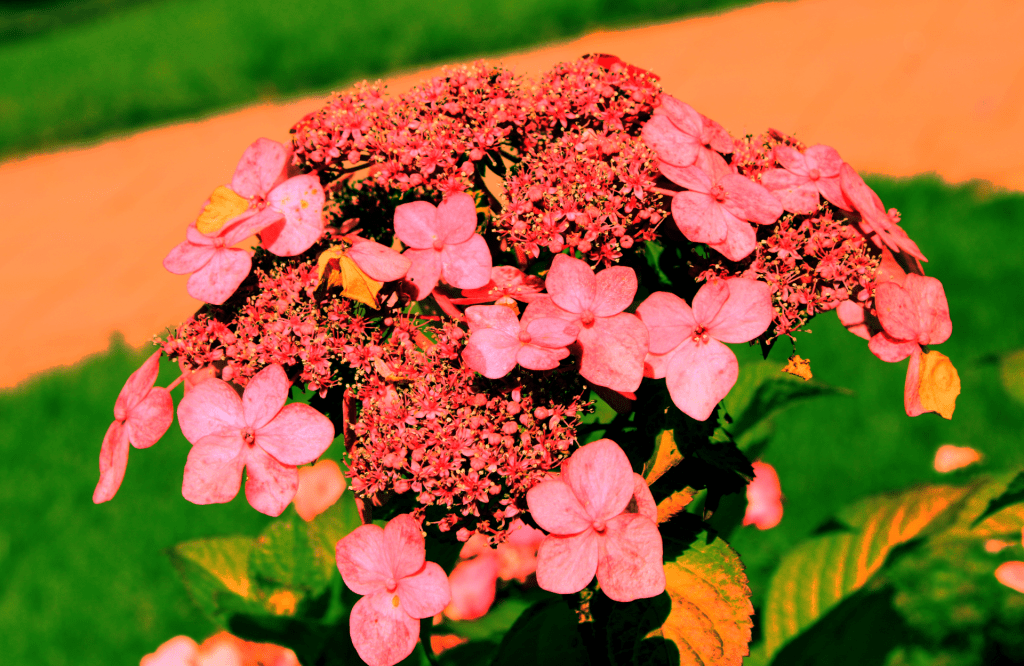
The photo of flowers where the color is the focal point is conveying the emotions of beauty and happiness. It is symbolizing good times and happy moments between people. Overall, the color of this photo can brighten someones day.
The elements of art that I would like to explore further in photography is value. I feel that there are so many ideas of pictures you can take while using value. Value can make the difference when it comes to a good or a bad photo.
The concepts or techniques that I want to experiment with for my next project is space. I can experiment with the fore, mid, and background which can highly enhance a photo. Another technique that I can experiment with is the orientation. This will give my photos a new element by giving them either a horizontal or vertical angle.
2 thoughts on “Amazing Elements of Art”
FINAL FULL REPLY:
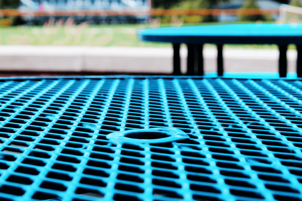
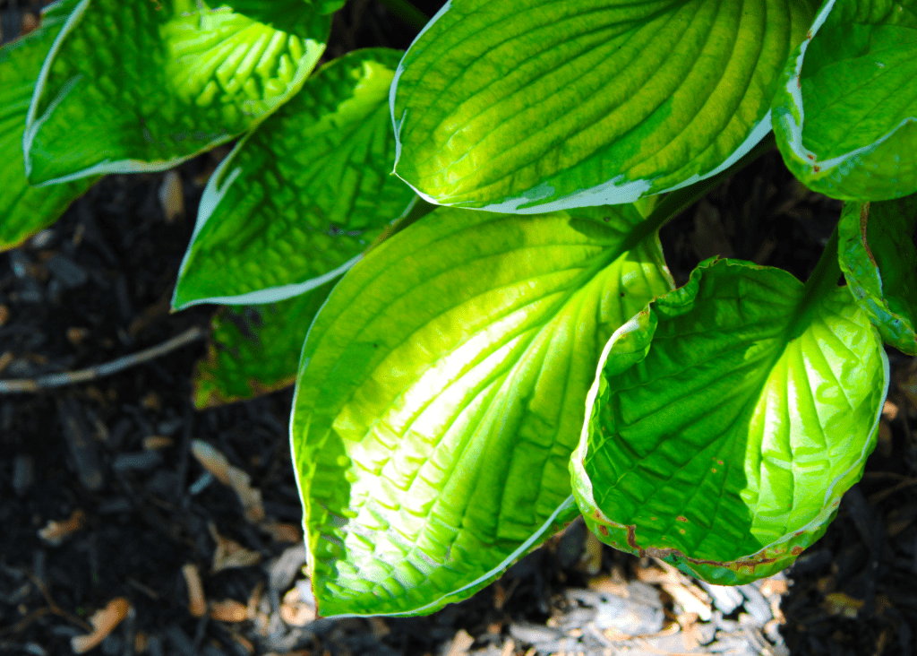
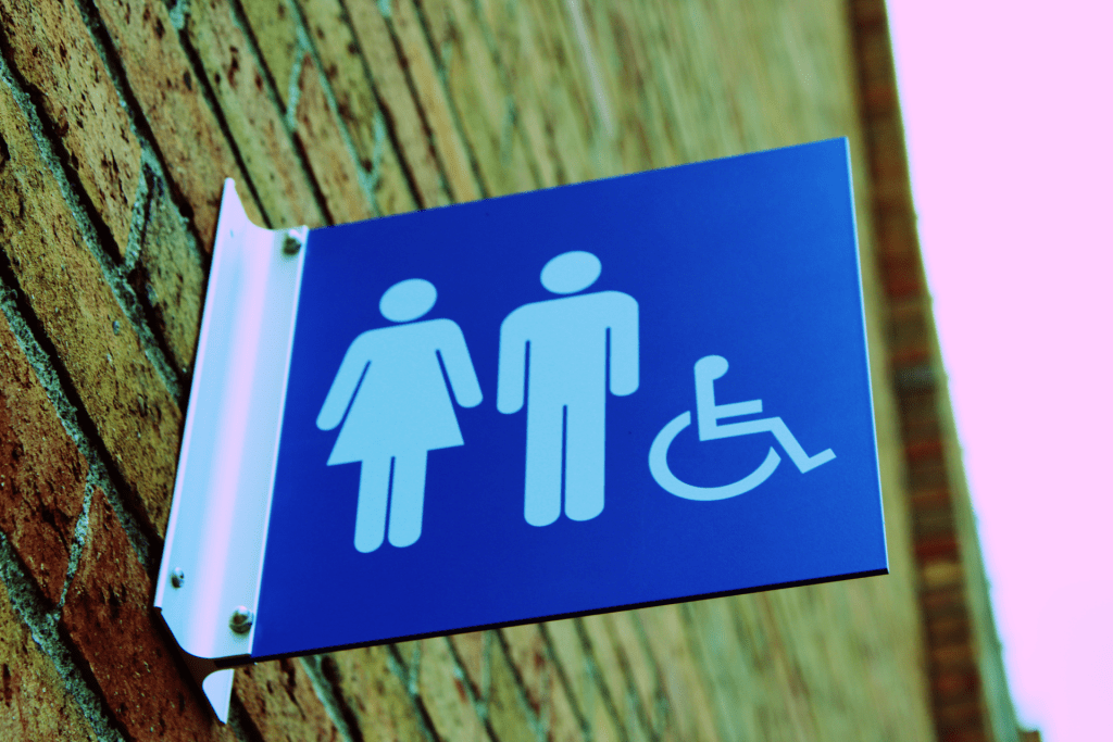
Critique: Michael did not make many mistakes, but I do believe that all photos have to be taken outside (unless I am incorrect). Besides this possible small error, Michael followed the rubric and took very good pictures. The photos he took and his photoshopping were very good, the colors matching with the background and the contrast and saturation matched very well. The focus that he did for each picture was well done because none of the pictures needed to be closer or farther to the subject. The two photos that were my favorite were the texture photo due to its main focus on the table and its pattern of holes and I enjoyed the organic picture due to its lines and shape of the plant. The focal point for the color picture could’ve been better, there was too much pink added to the picture, and it should be less pink as the focal point is already taking up a majority of the screen. The geometric element was interesting to me because of the LEADING LINES in the photo, automatically putting your focus on the bathroom sign rather than the background.
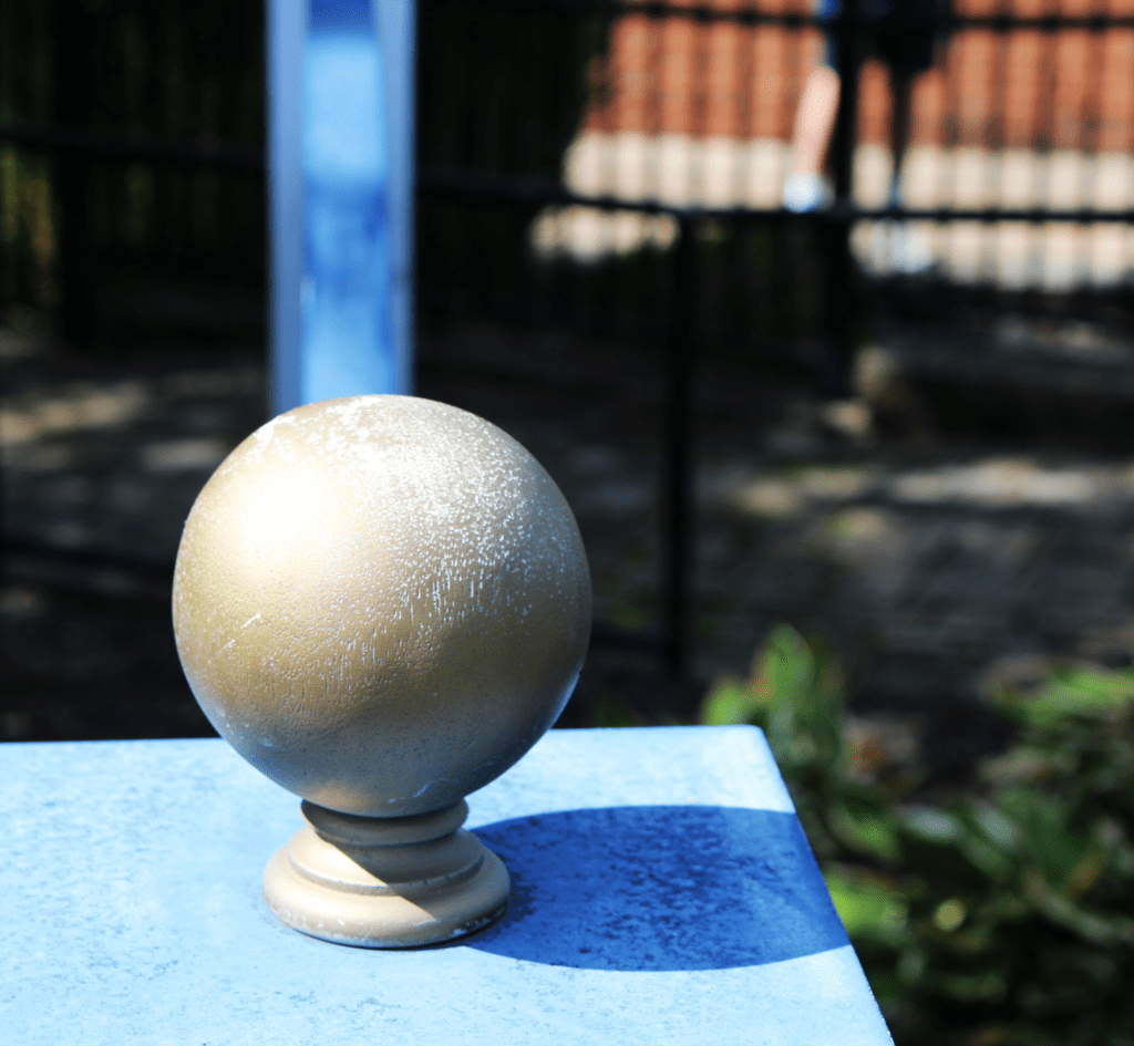
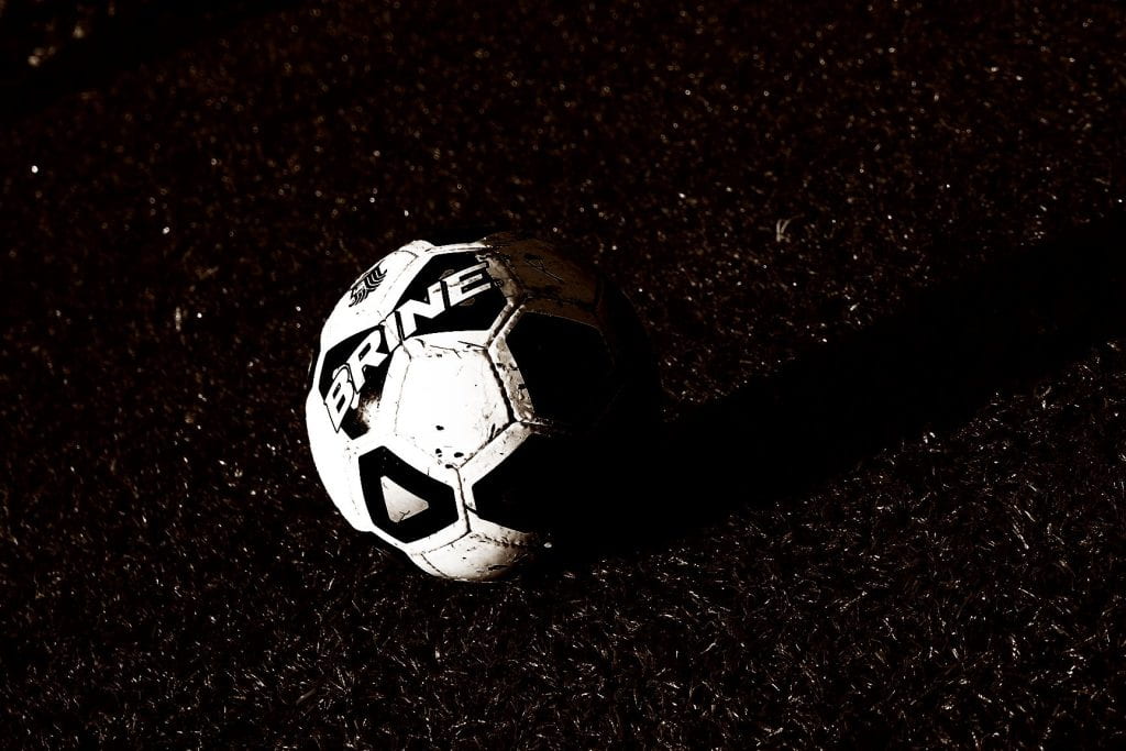
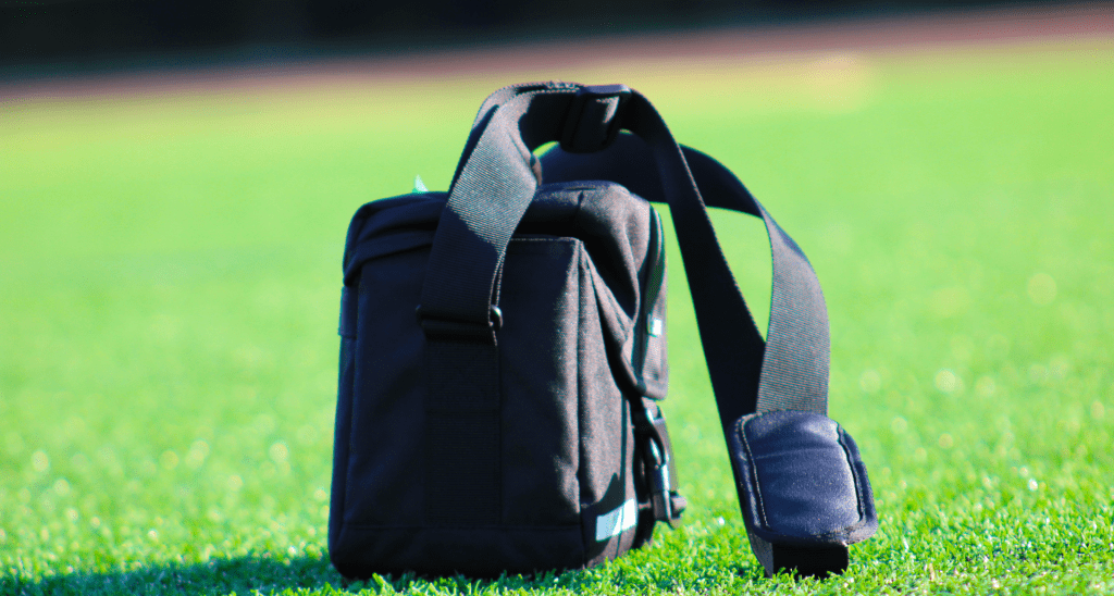
Critique: I like Michaels black and white final because the soccer ball is already white, but the color change on the turf makes the soccer ball pop in color. I also like the upclose picture of the tables on the patio because it also looks to me like it could also be a 3d photo. I think for the geometric shape, he could’ve done less editing because the sky is like a dark purple. I think he used framing for his form photo because it looks like the turf is taking over the camera bag.
FINAL FULL REPLY:
Critique: Michael did not make many mistakes, but I do believe that all photos have to be taken outside (unless I am incorrect). Besides this possible small error, Michael followed the rubric and took very good pictures. The photos he took and his photoshopping were very good, the colors matching with the background and the contrast and saturation matched very well. The focus that he did for each picture was well done because none of the pictures needed to be closer or farther to the subject. The two photos that were my favorite were the texture photo due to its main focus on the table and its pattern of holes and I enjoyed the organic picture due to its lines and shape of the plant. The focal point for the color picture could’ve been better, there was too much pink added to the picture, and it should be less pink as the focal point is already taking up a majority of the screen. The geometric element was interesting to me because of the LEADING LINES in the photo, automatically putting your focus on the bathroom sign rather than the background.
Critique: I like Michaels black and white final because the soccer ball is already white, but the color change on the turf makes the soccer ball pop in color. I also like the upclose picture of the tables on the patio because it also looks to me like it could also be a 3d photo. I think for the geometric shape, he could’ve done less editing because the sky is like a dark purple. I think he used framing for his form photo because it looks like the turf is taking over the camera bag.