Women Sports Empowerment

Art Statement:

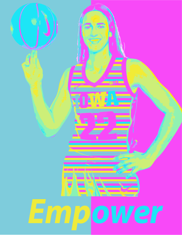
My artwork is to promote Women’s Heritage Month and Women’s sports. A notable figure that has done this over the recent years is Iowa women’s basketball player, Caitlyn Clark. This piece of art is is bold and meant to stand out which represents Women’s Heritage Month. Clark has promoted and has brought so much attention towards the women’s sports world. She has also put women’s basketball on the map and brought so much rise to the industry. I created my artwork by using both Adobe Illustrator and Adobe Photoshop. I used a multitude of technique and ideas to complete this piece of art. I used multiple layers and clipping mask to bring color and life to this poster. I also chose a bright and beautiful color panel to make this piece vibrant and animated. The big idea behind this art work is that I play basketball. I can relate to Caitlyn Clark in that way of playing basketball through out the year. I have also noticed that women’s basketball does not get as much publicity as men’s basketball. However, Clark has promoted the sport so much which was a big reason why I picked her as my figure. My goals for this artwork was to create a poster that really sent a message to the viewer. I wanted this poster to empower others to be like Caitlyn Clark and to do what they love. Everyone should pursue their dreams no matter how much publicity their hobby has behind it. What I learned in creating this artwork is that I should always be myself and not listen to what others think of it. I must follow through with my own unique ideas and not listen what others have to say. This piece of art will influence my future artworks by being unique and really using my creativity.

A Logo of Speed

Reflection:

The type of business my logo is designed for is for the luxury car industry. The logo for a special car that is luxury but also very sporty at the same time. This logo represents my business because it is a badge of cheetah. Cheetahs are very well-known for being crazy fast animals which represents the speed of the car. Ghepardo means cheetah in Italian which is more appealing to my audience. The target audience that this business is targeted to is towards the more wealthy. The car would be very expensive, so the audience would most likely have a lot of money and willing to spend it. This logo is appealing to the audience because the cheetah is very intimidating and looks mean and aggressive. This is telling to the audience because it is showing them that the car must be fast and swift. What I am most proud of this logo is how realistic the logo looks. It looks like a real Italian car brand logo and tells a certain message like Lamborghini and Ferrari. I think that one day this could be made better to be made a real logo for a car. However, I think I could have done better with the color choice of the logo and the font choice. I wanted the color to pop more with the logo and really stand out. I think the font is also a tad boring and could have been more unique. It looks like a better font.

The Fabulous Teenage Mutant Ninja Turtles


The subject of my illustration is one of the mutant ninja turtles hiding in the New York sewer.  I chose this subject because as a little boy this was my favorite show. Every morning at 8 a.m. sharp I would wake up just to watch every new episode. Choosing this topic brought so much nostalgia and brought so much joy while creating this. The thing that I like most about this art is how realistic it is. I feel that this poster could actually be a real concept that could be used for the show one day. The poster brings so many memories back from my childhood. The advice that I would give to another student before using the pictogram technique is to really use your creativity and to make your poster unique. I would also say to create a poster that sets a certain mood and theme. Your poster should be a preview and hint what your subject is about. Overall, when creating a pictogram poster it should be simple but also stand out to whoever is viewing it.

Final Goodbye Post

Loop Lighting
Paramount Lighting
Rembrandt Lighting
Split Lighting

Reflection:

My favorite portrait that I took was the one of the split lighting portrait. This is because of the fact that with the split lighting plus the black and white touch up goes really well together. I think that the split lighting also fits perfectly with Jalen. His face complements the lighting perfectly in this portrait.

Out of these techniques the one I can apply to future picture taking is the paramount lighting. I feel that this is the most common lighting to see out in the real world. Paramount lighting is also created by natural light which can be easily used in nature. In conclusion, this would be a beautiful lighting technique to use in the real world.

A Freeze in Time

Shutter Speed: 1/800 sec
ISO: 160
Aperture: f/5.6
Shutter Speed: 1/800 sec
ISO:125
Aperture: f/5.6
Shutter Speed: 4.0 sec
ISO: 100
Aperture: f/11

Reflection:

The advice that I would give to any other photographer shooting motion is that you should be creative. Create photos that have never been taken before, and out your own unique twist on it. There are so many ways to manipulate your photos and create something really intriguing to your viewer. The possibilities are endless when it comes to shooting motion pictures. You can snap a single scene when in reality so much other action is happening in real time. So overall, when it comes to shooting motion photos just make sure to be yourself, but also be really creative because there are so many possibilities when it comes to shooting motion.


My Glorious King

  1. I hope that my composite image communicates to the viewer a sense of humor. The picture is more to make someone laugh rather than teach the viewer something. However, the picture can also teach the viewer about history and sports. The statement that my piece is making about culture today is that it connects sports and humor to history. Lebron James’s nickname is known as King James, so I photoshopped his head on the actual King James I. The two people can be connected due to today’s culture. 
  2. The advice that I would give to a person looking to create a composite image in Photoshop is to choose a picture that is not blurry. If your photo is blurry then when you merge it with another photo on Photoshop then it will not look the best when you are done. This will also make the photo look way more pixelated which doesn’t look great when using photoshop. Other advice that I would give to another person would be to choose two images that really resonate with each other. This will create a message that is being conveyed to the viewer. 

The Beauty of Abstract Art

Refraction
Shadows
Water Beads
Water & Oil


a. What is the distinct mood of the photograph? Explain.

In my post with shadows I feel that the mood is very dark and eery. The shadows from the glass creates an interesting scene where the shadow looks bigger than the glass. There is also a very cool reflection off of the glass when the lights is being directly pointed at it. The glass also becomes very shiny and appealing to the person looking at it.

b. What does the photo make you think about? Explain.

The photo about shadows makes me think about a horror movie or a haunted house due to the fact that it creates a spooky shadow. The photo looks like it would be apart of a scene from something scary. The red color also gives the photo a dark effect with can create a horror scene in the watchers mind.

c. What in the photo jumps out at you? Explain.

The thing that jumps out to me the most in the photo about shadows is the color of the glass when the light is pointed at it. This creates another element to the photo along with the actual shadow. It also draws peoples eyes directly to the photo immediately. To add on the color of the red makes the glass have a sort of glamour effect with is very appealing.

d. How does the photo make you feel? Explain.

This photo makes me feel infuriating, but also anxious due the red color. The color red always reminds me of anger and the feeling of being mad. The shadow is also much bigger than the actual object which creates the feeling anxiousness and anger.

e. What advice would you give to next year’s students for shooting abstract photography? Explain.

The advice that I would give to next years students for shooting abstract photography is to be yourself and snap whatever ideas come to mind. The idea of abstract art comes from creative and unique ideas that first come to mind. You should also experiment and take risks while shooting abstract photography. Finally, when you edit make certain elements of the photo pop so that the person that is looking at your photo is drawn to it.

Palatable Portraits Reflections

Taken in my kitchen at my home
Taken outside the OP Soccer Field


Question 1: The reason why I chose these foods to take a picture of is because I eat them on a daily basis. They are common foods that I eat in my everyday lives. I can relate to both foods which is why I chose to take pictures of them. I also chose these foods because of their bright colors that can pop due to the color splash effect.

Question 2:  The lighting in both of my photos were very similar because it was cloudy that day. This effected the lighting which made the photo look darker because it was cloudy and raining. I now know that next time I should take photos that produce more light so that they pop and are vibrant.

Question 3: The composition technique that I tried to use when editing my photos was the framing technique. I tried to put my photos in a position where they would be intriguing to person looking at them. I cropped my photos so that the full focus would be on the person and the food, and less of the background. I cropped out most of the background so that the portrait stood out.

Question 4: The colors in the color splash technique contributed greatly to the overall photo. This is because they gave other elements to the photo as they made it pop and way more vibrant. I chose to mask the specific colors in each photo because it made the photo more visually appealing. I thought that the parts that I chose to mask provided an extra effect to the photo.

Question 5: When I took my second photo from home I used the portrait mode. This helped the photo focus on the person that was eating the food. It also reduced the blurriness that the photo had. It made everything clear that the photo could stand out and pop.

Question 6: The advice that I would give next years class for making portraits is when taking photo on your phone always use portrait mode. This make the photo more clear and less blurry for the person looking at your photo. The second pice of advice that I would give next years class is that you should use foods that I bright and warm colors. This will give the final product a more vibrant look rather than a dull color.

Amazing Elements of Art

Space – Depth of Field
Value – black and white final
Texture
Space – not a lot of space – close up
Shape – organic
Shape – Geometric
Line – natural
Line – man-made
Form – feels 3D
Color – one color is the focal point
  1. The strengths that I am seeing in my own work is that when I edit my photos I am making the color pop. Many of my photos in the past have been blurry, but in this collection they are clean and clear pictures. The weaknesses that I am seeing in my photos is that I should use better angles when taking photos.
  2. I can improve my approach in future photography projects by looking how the light falls on an object. I can get some amazing looking photos if I focus on how the light lays on an object. If I angle myself better when taking photos, they can be much more intriguing.
  3. The photo of flowers where the color is the focal point is conveying the emotions of beauty and happiness. It is symbolizing good times and happy moments between people. Overall, the color of this photo can brighten someones day.
  4. The elements of art that I would like to explore further in photography is value. I feel that there are so many ideas of pictures you can take while using value. Value can make the difference when it comes to a good or a bad photo.
  5. The concepts or techniques that I want to experiment with for my next project is space. I can experiment with the fore, mid, and background which can highly enhance a photo. Another technique that I can experiment with is the orientation. This will give my photos a new element by giving them either a horizontal or vertical angle.