
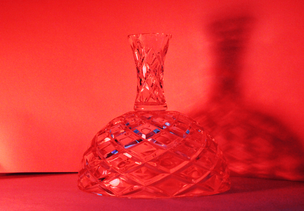
a. What is the distinct mood of the photograph? Explain.
In my post with shadows I feel that the mood is very dark and eery. The shadows from the glass creates an interesting scene where the shadow looks bigger than the glass. There is also a very cool reflection off of the glass when the lights is being directly pointed at it. The glass also becomes very shiny and appealing to the person looking at it.
b. What does the photo make you think about? Explain.
The photo about shadows makes me think about a horror movie or a haunted house due to the fact that it creates a spooky shadow. The photo looks like it would be apart of a scene from something scary. The red color also gives the photo a dark effect with can create a horror scene in the watchers mind.
c. What in the photo jumps out at you? Explain.
The thing that jumps out to me the most in the photo about shadows is the color of the glass when the light is pointed at it. This creates another element to the photo along with the actual shadow. It also draws peoples eyes directly to the photo immediately. To add on the color of the red makes the glass have a sort of glamour effect with is very appealing.
d. How does the photo make you feel? Explain.
This photo makes me feel infuriating, but also anxious due the red color. The color red always reminds me of anger and the feeling of being mad. The shadow is also much bigger than the actual object which creates the feeling anxiousness and anger.
e. What advice would you give to next year’s students for shooting abstract photography? Explain.
The advice that I would give to next years students for shooting abstract photography is to be yourself and snap whatever ideas come to mind. The idea of abstract art comes from creative and unique ideas that first come to mind. You should also experiment and take risks while shooting abstract photography. Finally, when you edit make certain elements of the photo pop so that the person that is looking at your photo is drawn to it.
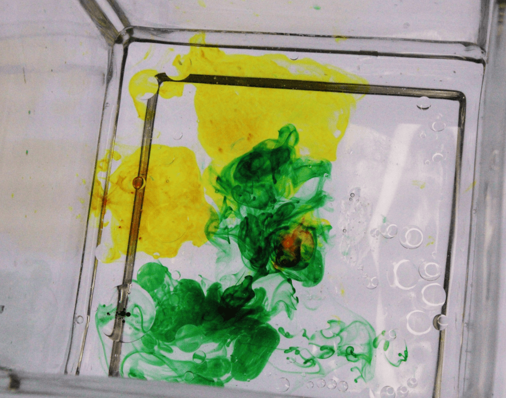
The 2 colors used definitely work together. I can definitely tell you used the correct and even amount.
The angle of the picture is a little eye-catching. Because it’s not too centered it just looks a little off. Also the 2 colors aren’t too blended together. I would love to see the after color of the 2.
Try to take as many pictures as possible. Also try different angles too. It’s not bad at all though.
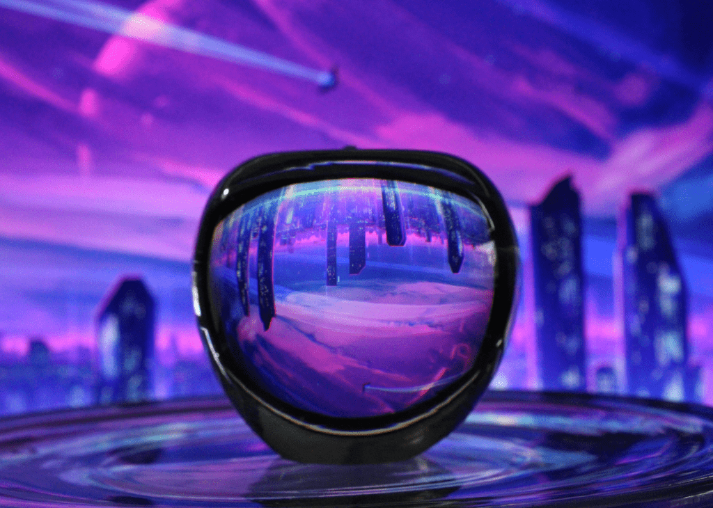
I really like the read lightning in the photo and the lines made on the walls from the thingy. They look seamlessly. I also really like the lines of blue it makes it look really interesting and cool.
I think the brightness of the photo could be toned down a little bit because there is so much red that it is too vibrant in my opinion. Perhaps some areas besides the shadow could be slightly darker as the shadow also seems to be faded and doesn’t really pop even though its the focus of the photo. The shadow could also be made darker.
All I think this artist needs it to set his sights on one part of the photo. If he focused on the shadow instead I think the shadow would pop out alot more. But the photo still looks good and I like it.